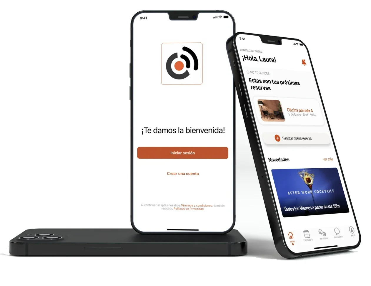

Case study · Client project
Tourist: redesigning a tourism booking site around price and trust
Tourist offers adventure tourism and local experiences in Argentina. It started small, focused on San Rafael, Mendoza, with the goal of expanding across the country. As the only designer, I surveyed travelers, audited the live site, rebuilt the structure and designed the new site, working with two developers to implement it.
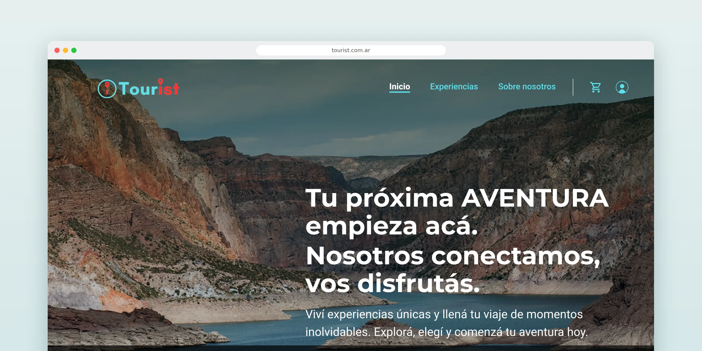
Problem
Great experiences. So why did booking one feel like a gamble? No prices, ratings stuck at 0.0 and a login wall before checkout, for travelers who were already struggling to trust booking sites.
What I did
A survey of 37 travelers, a benchmark of 5 competitors and an audit of the live site. Then a shared design system, a new structure, and a booking flow built to earn trust.
Result
A research-backed redesign the client approved and took into development: a friendlier interface and a smoother way to book, built on one shared design system.
Context
Who was booking, and what they found
Tourist offers experiences across adventure, nature, gastronomy, culture and excursions. The catalogue had grown over time, but no one had looked at who was booking or what they needed to decide.
The travelers. Mostly 25 to 34 (54%), traveling with friends (49%), solo (46%) or as a couple (43%), and half of them several times a year.
The site. What they found didn't answer the first question anyone asks before booking: how much? The basics needed to decide were missing or broken:
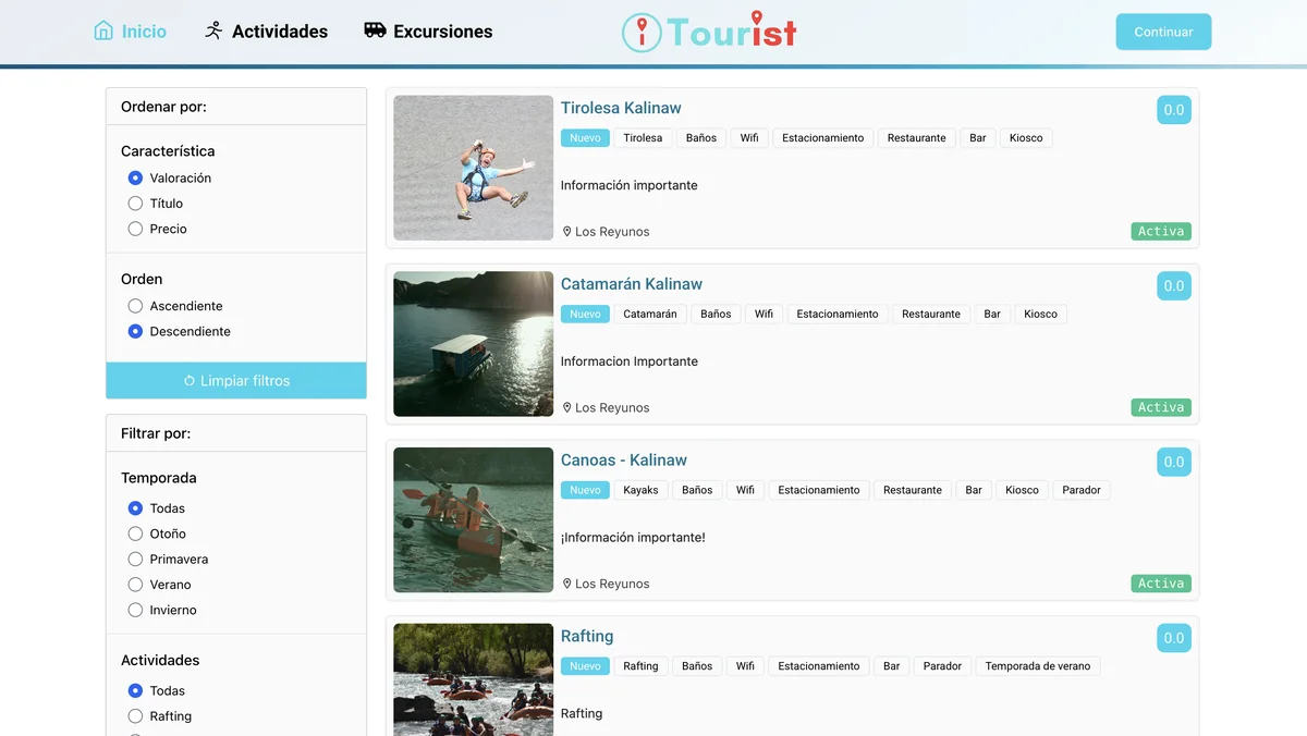
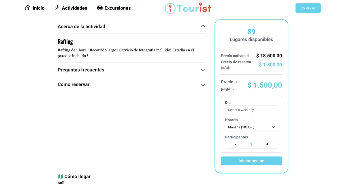
No sense of one product. Each page looked like it belonged to a different site: a dark homepage with condensed all-caps titles, a light generic catalogue with other buttons, and a menu that never showed where you were. What was missing was a shared system.
Research
Price and trust, not inspiration, were stopping people
The site had grown without any research behind it, so before changing a single screen I wanted to know what made travelers hesitate. I used three methods, each answering a different question:
Survey
37 travelers
What do travelers need before they book, and what stops them?
Benchmark
5 competitors
What do other platforms do well, and where is the gap? Viator, GetYourGuide, Civitatis, Tangol and Ecoturismo.ar.
Heuristic audit
18 issues on the live site
What's broken today? Each issue on the homepage and navigation scored by severity and effort to fix.
- Everyone is watching the budget. No one described their budget as premium: 60% look for good value and 40% prioritize low cost.
- Trust comes from clear, current information. 49% said information on travel platforms is unclear or out of date. Some respondents prefer to skip booking online and buy at the destination.
- The gap in the market. Viator and GetYourGuide set the standard for filters and reviews. The local players knew the region but felt dated. Tourist could offer both: local experiences with the clarity of a global platform.
Design decisions
Five decisions that shaped the site
The first plan was a visual fix. Research showed the problem went deeper: travelers didn't need a prettier site, they needed reasons to trust it. So the goal became showing what an activity is and what it costs in as few clicks as possible, with the details people need to decide right there.
What I learned
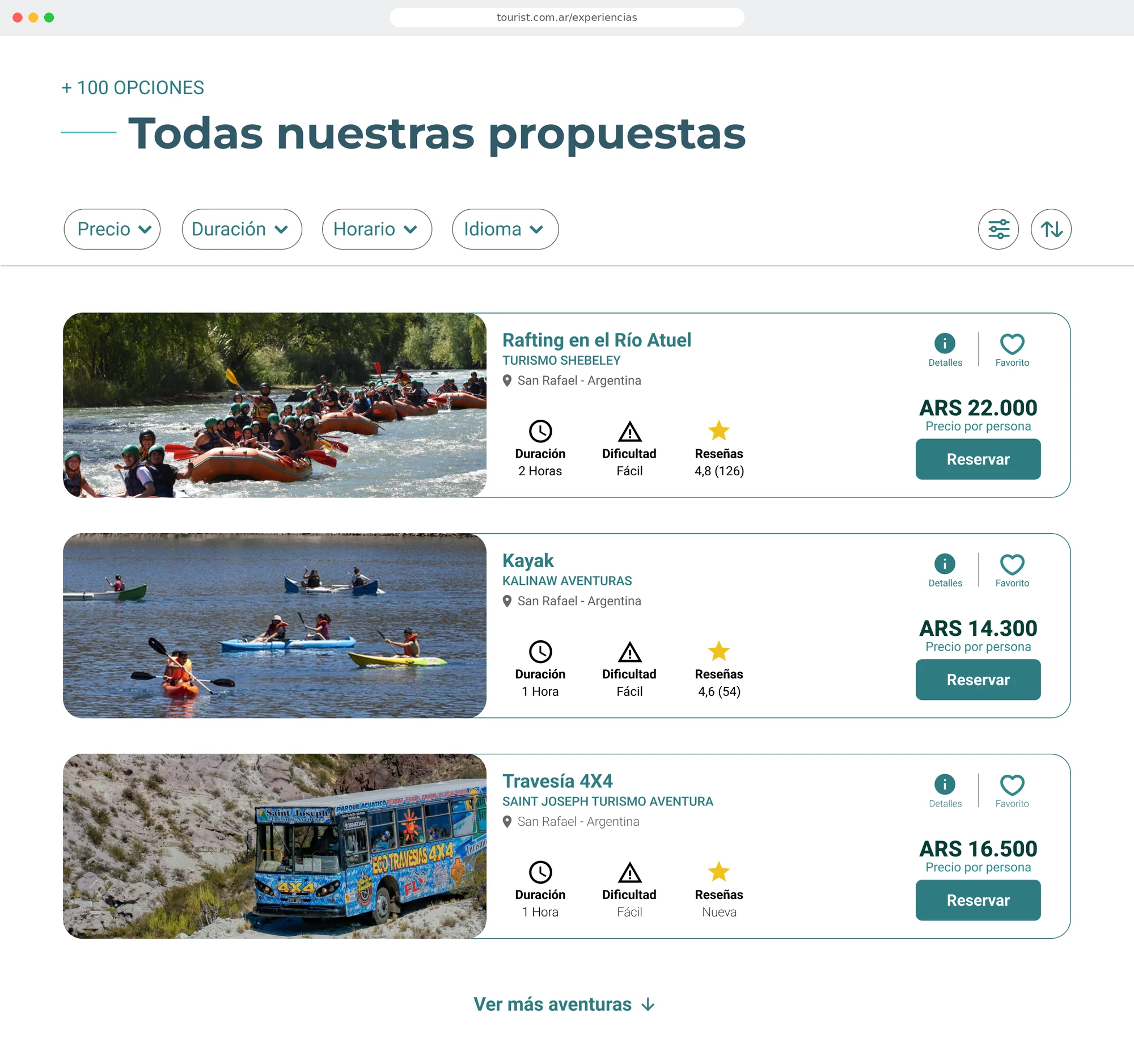
57% named price as their biggest difficulty, and the old site didn't show prices until the experience page, where it showed two.
What I changed
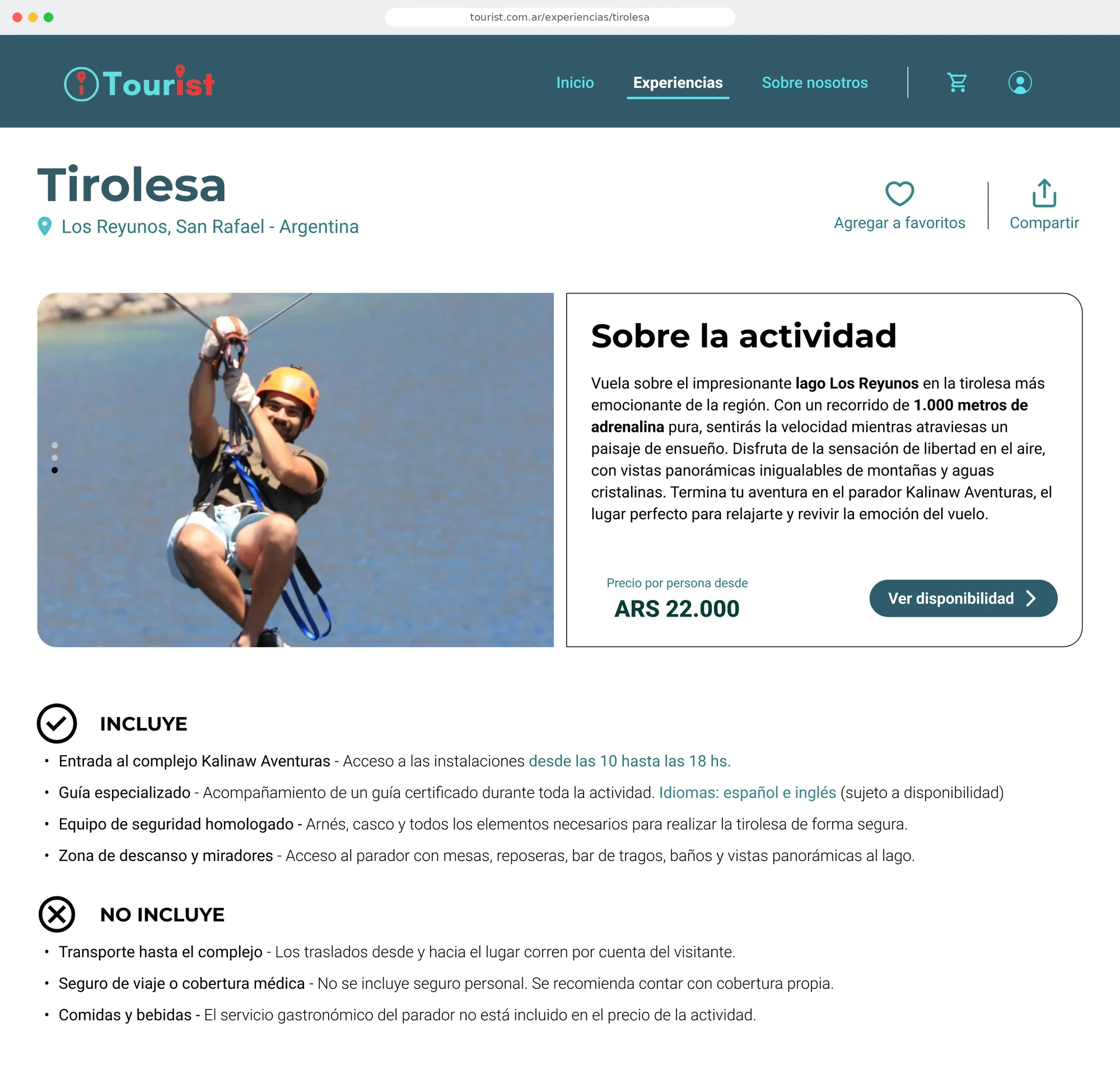
Price and what's included, up front
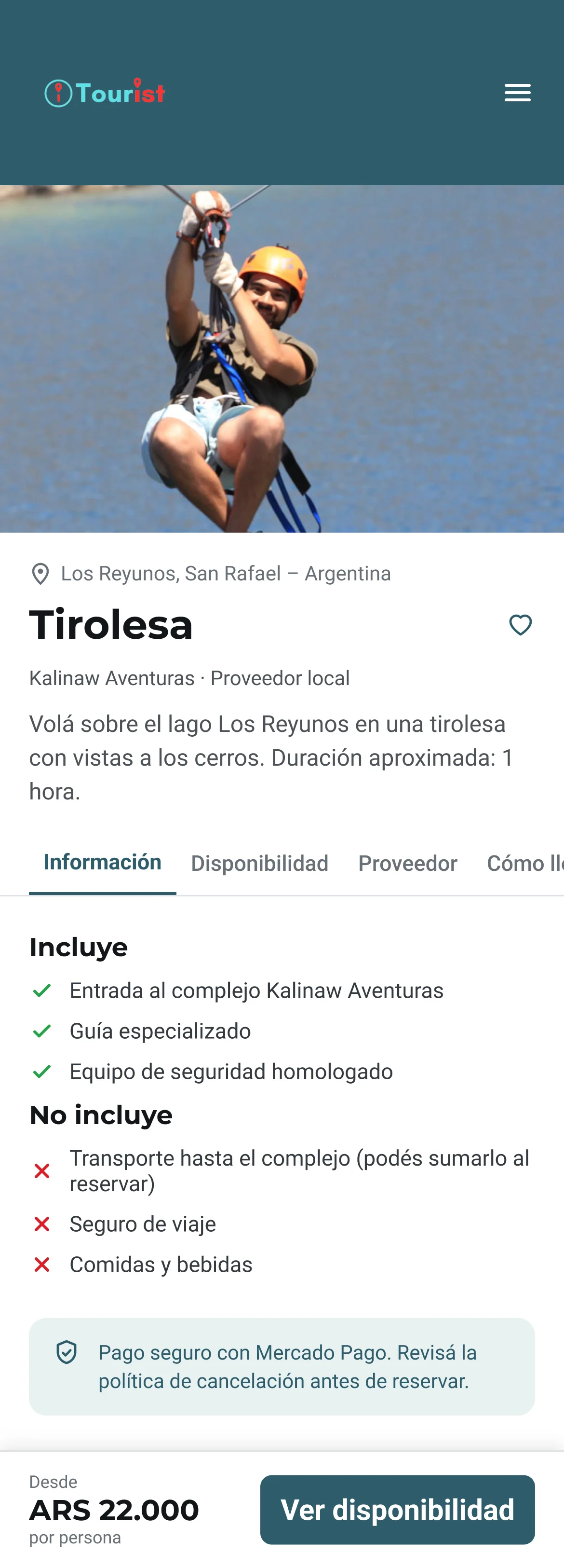
Price per person on every card and at the top of each experience. "Includes / Doesn't include" lists, so transport, insurance and meals aren't a surprise at checkout.
Why: A price you can see early works like a promise. Travelers can rule out what doesn't fit their budget before clicking, and listing what isn't included removes the hidden costs that 57% complained about.
What I learned
The audit's most severe issue was that there was no search. And the experiences last a day, so asking for arrival and departure dates, like a hotel search, made no sense.
What I changed
Search first, then filters that match how people plan
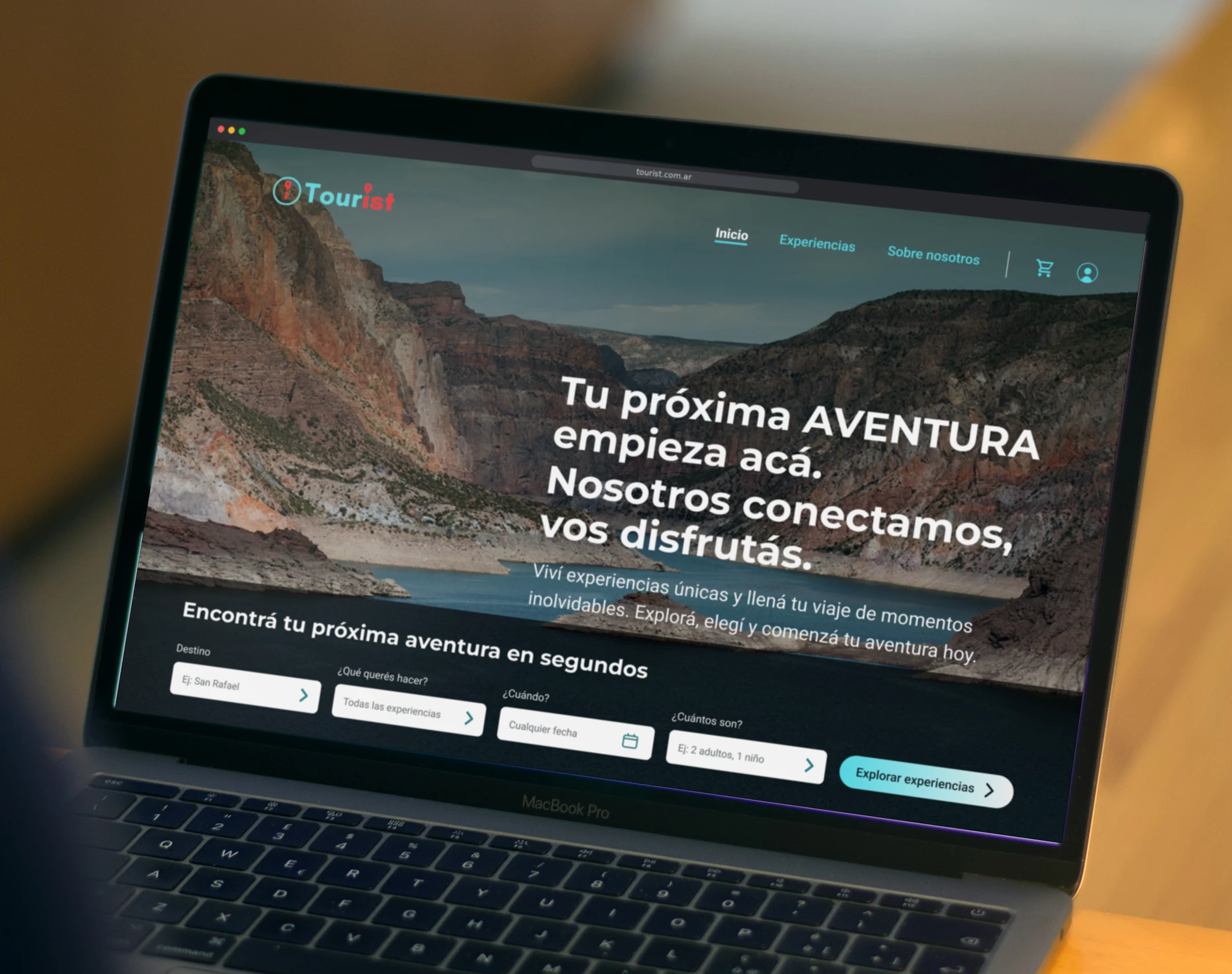
The homepage opens with a short search: where, what you want to do, one optional date and how many people. The catalogue filters by price, duration, time and language.
Why: Fewer fields make the first step easier. An optional date works for the many travelers who decide on the spot, and the filters answer the questions people ask before booking: how much, how long, when and in what language.
What I learned
In the open answers, travelers kept describing trips that combine several things: eating well, getting to know the place and doing activities, ideally in one plan. In the survey they mixed nature (78%), food (62%), adventure (57%) and culture (54%), on a careful budget.
What I changed
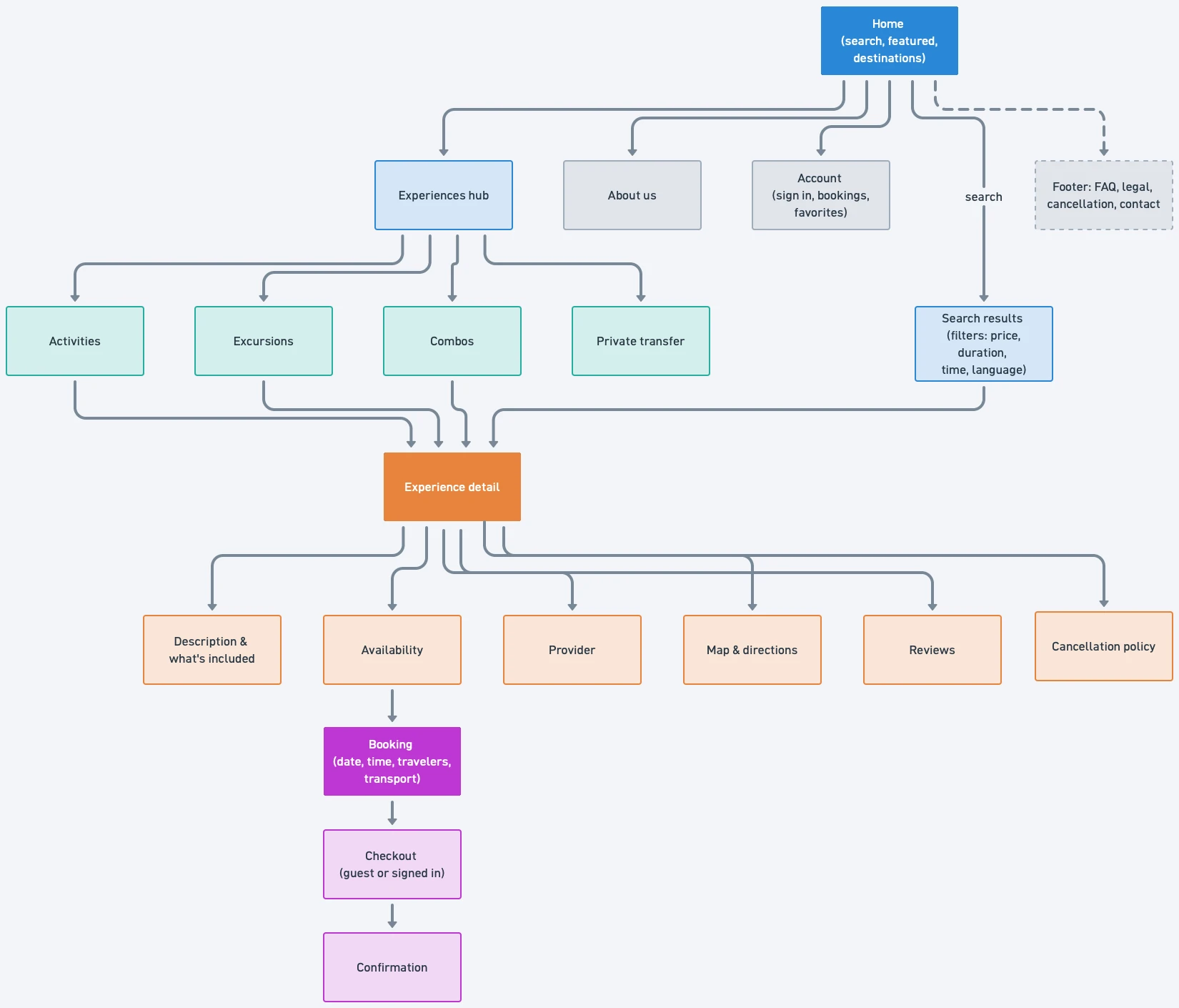
Activities, Excursions and Combos
Three clear entry points instead of one long catalogue. Combos work like a ready-made itinerary: several experiences at better prices negotiated with providers, with Tourist building the schedule and making the bookings. For the client, it was also a new source of revenue: a small fee for planning the trip.
Why: Combos turn a list of activities into a plan. Travelers get one booking instead of several, at a better price, and Tourist gets a reason for them to book everything in one place.
What I learned
84% want experiences they can't find elsewhere, and 59% care that a local runs them.
What I changed
The local provider is always visible
Every card names the operator, and each experience has a "Provider" tab, so travelers know who they're booking with.
Why: Local knowledge is the one thing global platforms can't copy. Naming the operator makes it visible, and gives travelers someone concrete to trust.
What I learned
51% find it hard to trust booking platforms, and 78% need to see the price and cancellation terms before they book.
What I changed
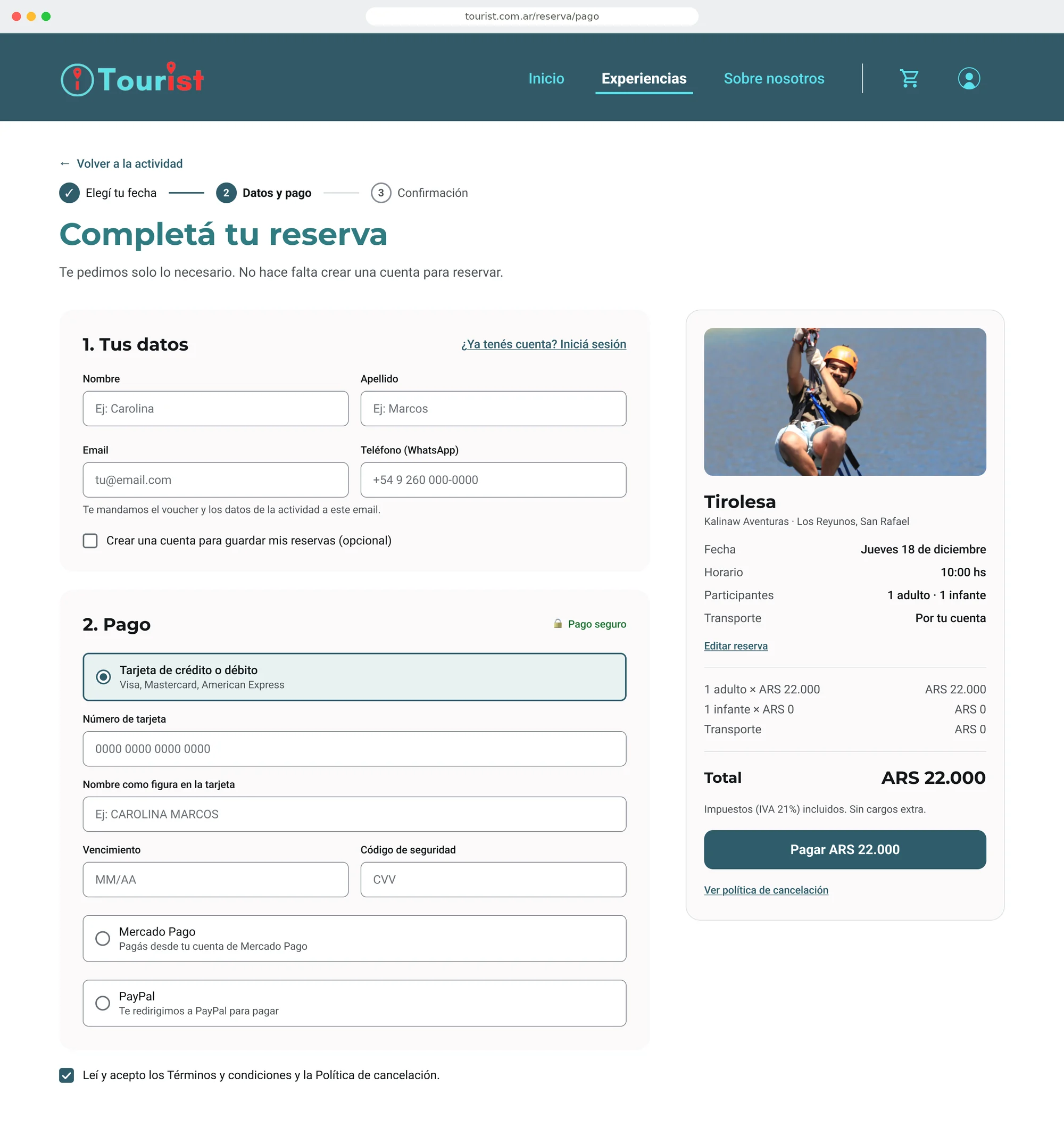
Cancellation, secure payment and support, up front
Cancellation terms, payment security and how to get help sit on the experience page, before the booking button, not in the fine print at checkout.
Why: Doubt is what makes people abandon a booking. Answering "what if I need to cancel?" before the button means travelers decide with all the information in front of them.
Iteration
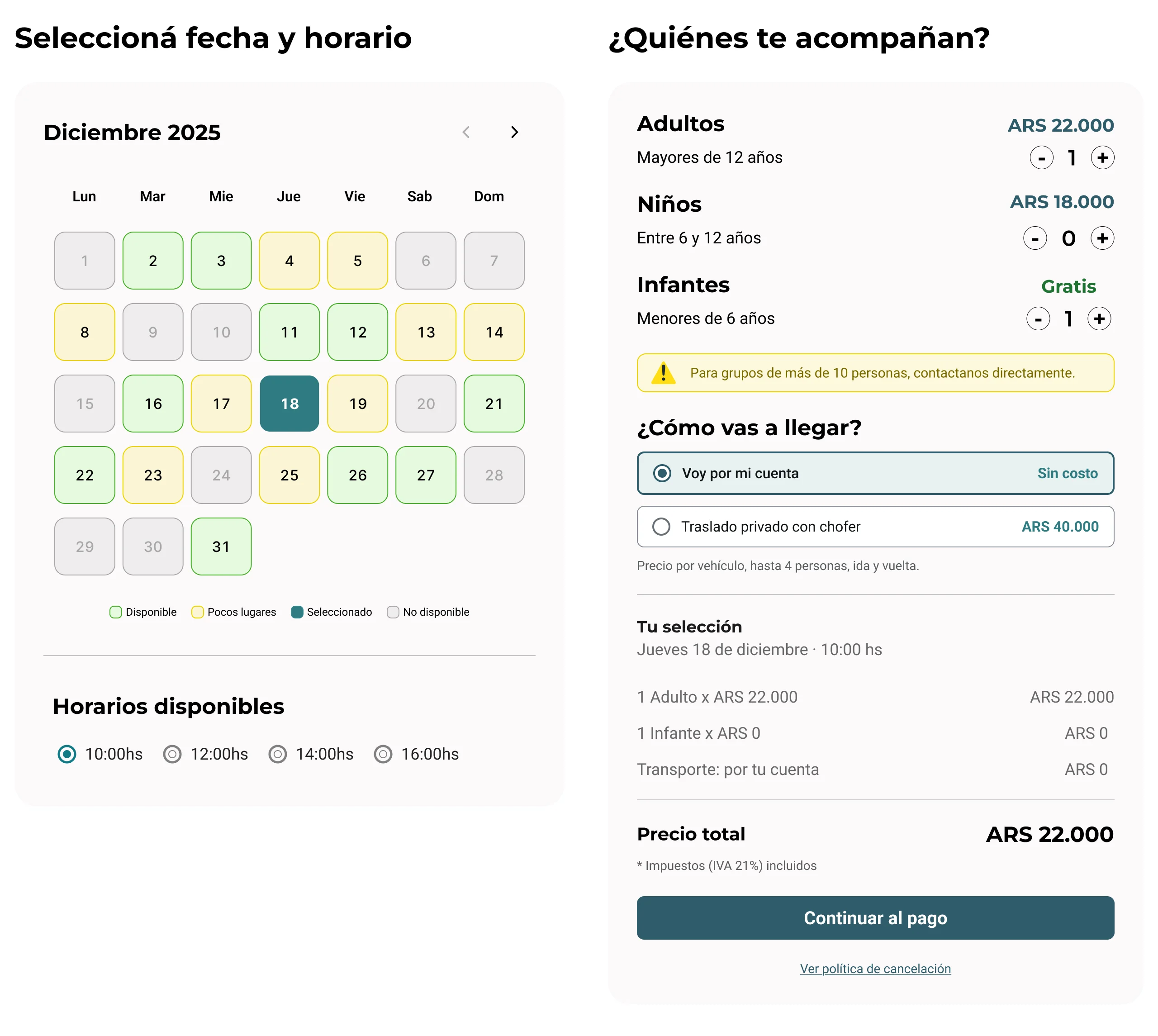
Getting there became part of the booking
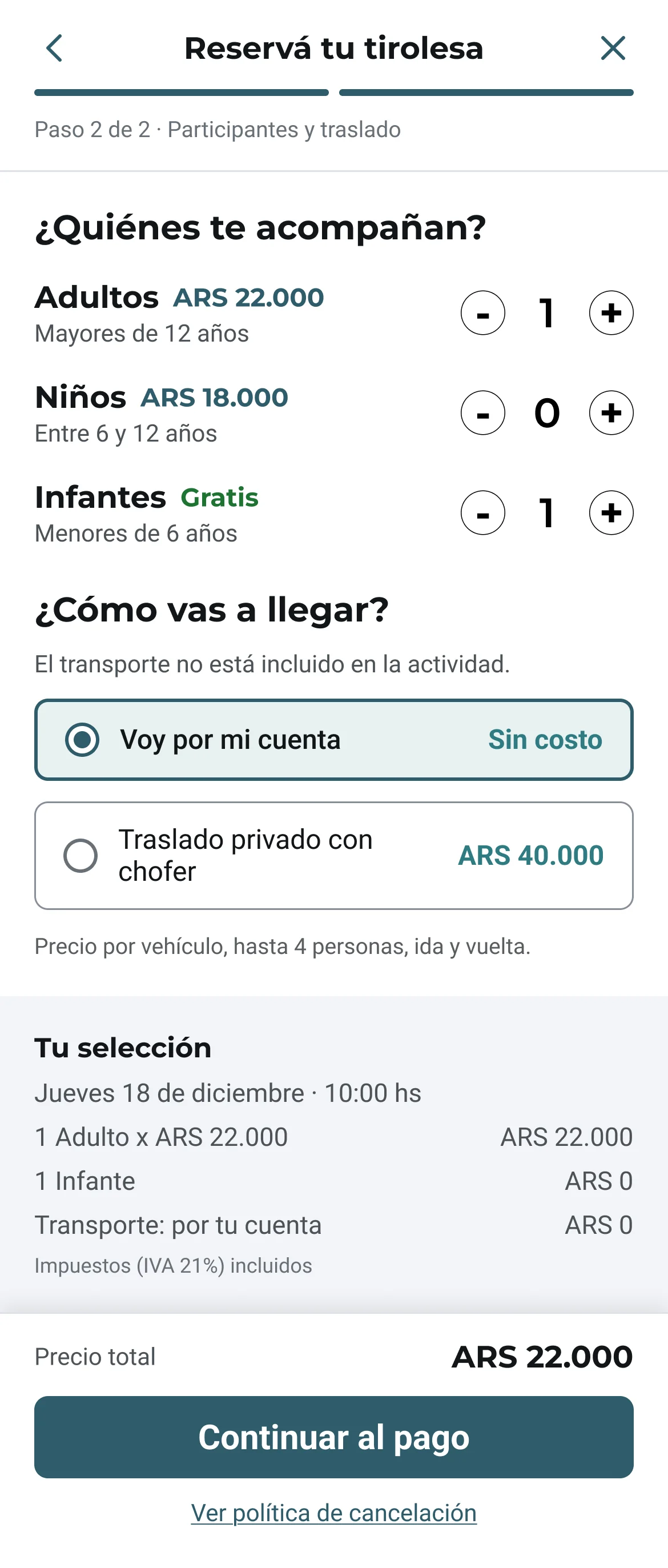
Many experiences sit outside the city and transport isn't included, so getting there was a gap in the booking that also came up in the survey's open answers. I split the answer into two versions:
"I'll get there on my own" comes first and selected, so no one pays for transport by accident. Groups bigger than 4 see the private transfer disabled, with the reason and a way to contact Tourist.
First version
No reviews
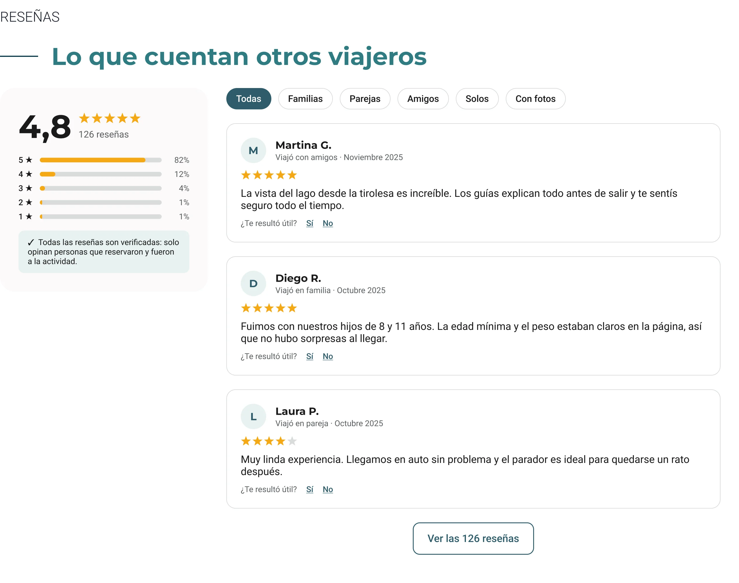
My first plan focused on the visuals, so reviews weren't part of it. Then 76% of travelers said they need other people's opinions before booking.
Final version
Verified reviews, filtered by who you travel with
A rating summary, reviews only from people who booked and went, and filters for families, couples, friends and solo travelers, matching the ways people in the survey travel.
Why: Reviews do something no description can: they come from someone who isn't selling. Filtering by travel group lets a family read what other families thought.
Edge cases
When the booking doesn't go to plan
Beyond the path where everything works, I designed what happens when it doesn't, using the same components as the rest of the booking.
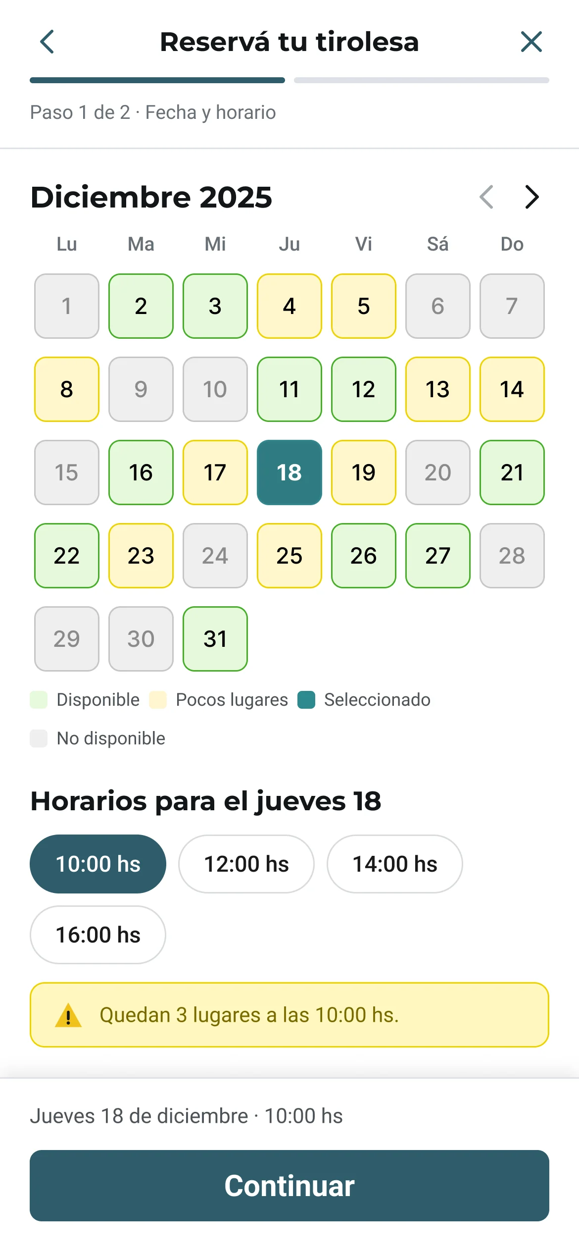
- Date and timeFew or no spots? The calendar shows it before you pick.
- TravelersGroup too big for the slot? Other times that day with room.
- TransportMore than 4 people? The transfer is disabled, with a way to get help.
- PaymentSold out while paying? No charge, pick a new time.
- ConfirmedCode, meeting point, directions and calendar.
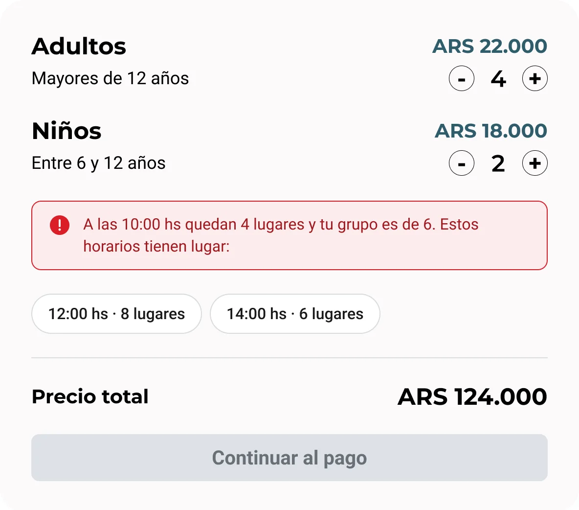
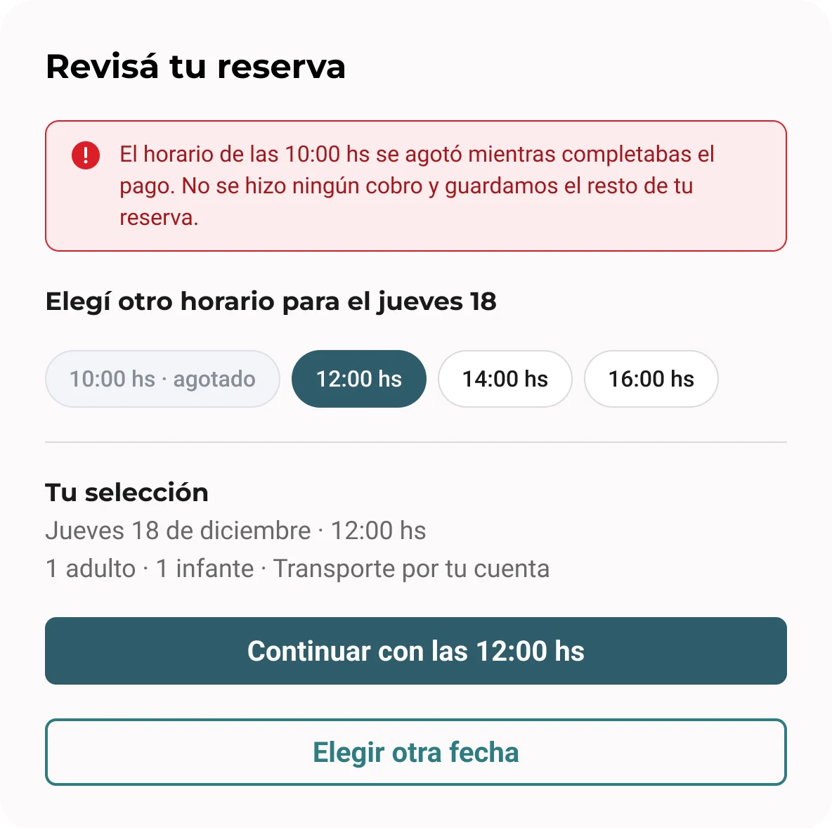
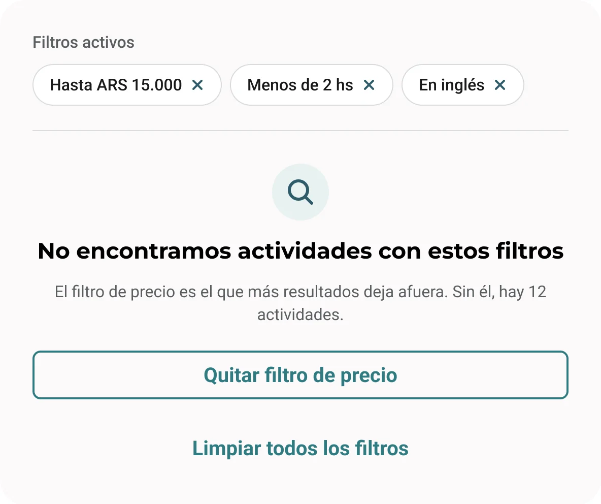
Names, codes and prices are sample content.
Mobile
The same booking, on a phone
On a small screen, the side-by-side booking panel became two short steps with a progress bar: first the date and time, then travelers and transport. The price and the next action stay pinned to the bottom, so the traveler always knows what it costs and what comes next. Every screen uses the same components as desktop.
Design system
One system, so every page feels like the same product
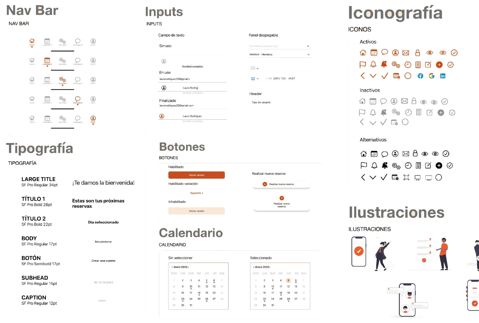
Before rebuilding the screens, I defined a shared system in Figma: a teal primary scale with semantic colors, Montserrat and Roboto on a fixed type scale, an 8 px spacing grid, and components in every state, from buttons and fields to cards, the calendar and the booking panel.
Accessibility was part of the system, not a final check. Text meets WCAG AA contrast (4.5:1) and controls meet 3:1. I darkened the main teal for small text, and no state relies on color alone.
Why: consistency is a trust signal. When every page behaves the same, the site feels reliable, and the two developers had one set of components to build from.
Working with developers
Designing for the two people who would build it
A static screen doesn't say what happens on hover, on error or on a small screen, so I annotated the Figma file with spacing, states and interactions, and we met to review each build against the design.
One gap came up during handoff: the homepage showed destination cards for places like Buenos Aires and Córdoba, but Tourist didn't have activities there yet. So I added a "Coming soon" state to the card component. The card stays on the homepage, dimmed and labeled, but it can't be clicked.
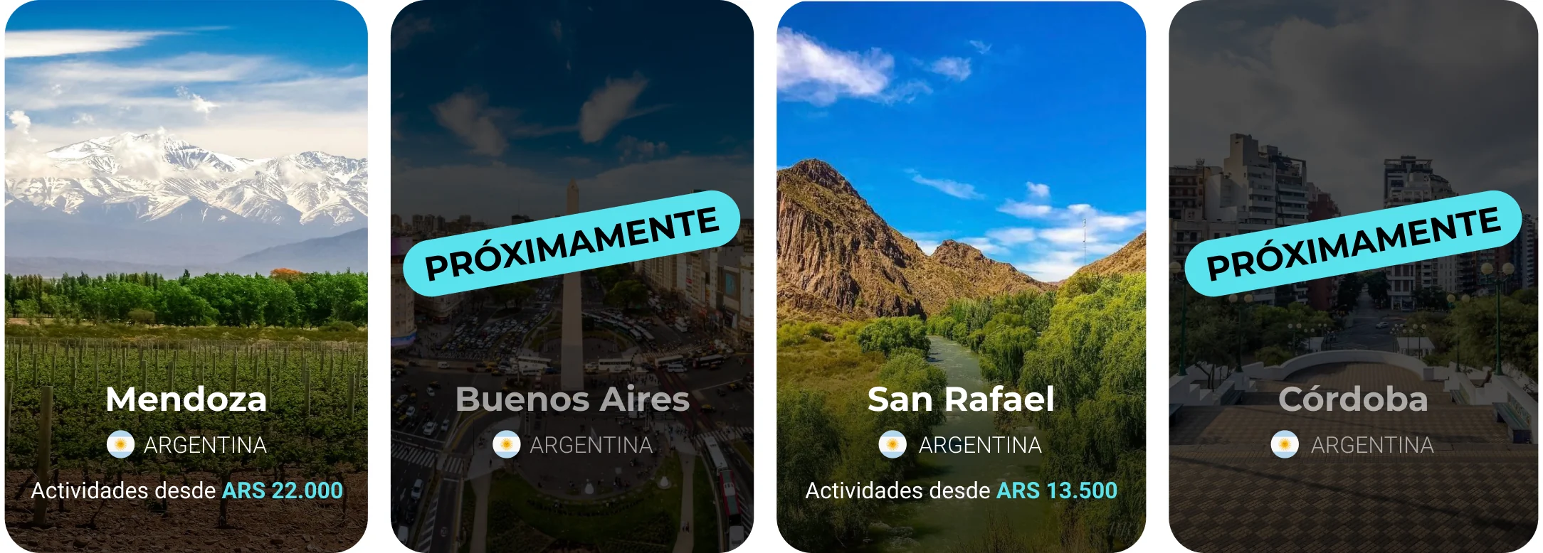
Search follows the same rule: typing a destination that isn't ready says it's coming soon and suggests the places that do have experiences.
Outcome
What happened next
The new design started being implemented. Before it was finished, the business was sold and the new owners took the site in a different direction, so I don't have launch metrics to share.
If it had launched, I'd have tracked booking completion from experience page to confirmation, use of search and filters, and how often transport is added to a booking.
Version 1 was about earning trust on the first visit. The planned Version 2 was about bringing travelers back: an automatic review request after each activity, while the experience is fresh, and a membership with rewards for booking and reviewing, since everyone in the survey was watching their budget.
Reflection
What I'd take into my next project
- Research changes the brief. I expected a visual redesign. The data showed the real problem was trust, which moved my priorities from visuals to information.
- Plan for what can go wrong from the start. A booking flow is defined as much by its errors as by its happy path: no spots left, a group that doesn't fit, a payment that fails. From now on I map those states alongside the main flow, so they shape the design instead of being patched in later.
- Make the most of the research there's time for. The client wanted to start the redesign quickly, so there was no room for interviews or usability testing. I worked from the survey, the benchmark and the site audit. A survey shows what people feel, but not always why, so in my next project I'd push for a few interviews and a quick usability test of the main flow, even with a tight timeline.
Next case study